Evolve X App
Project Vision
Evolve X connects interns with small businesses and philanthropic causes. Our goal was to create a unifying mobile platform that simplifies collaboration and eliminates the friction of switching between multiple standalone apps.
The Challenge
"Users faced slow onboarding, scattered files, and app-switching fatigue. We needed to unify team chat, calendar functions, and file storage into a single, tailored workflow."
UX/UI Designer & Team Lead
Collaborated on research, flow optimization,
and high-fidelity prototyping.
Jan – June 2020
Included 3 months of post-design collaboration with
developers.
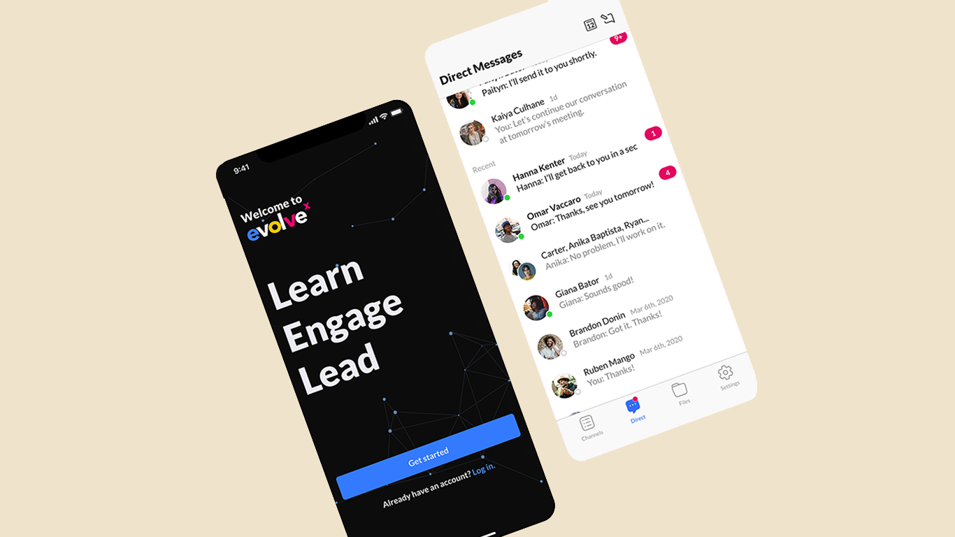
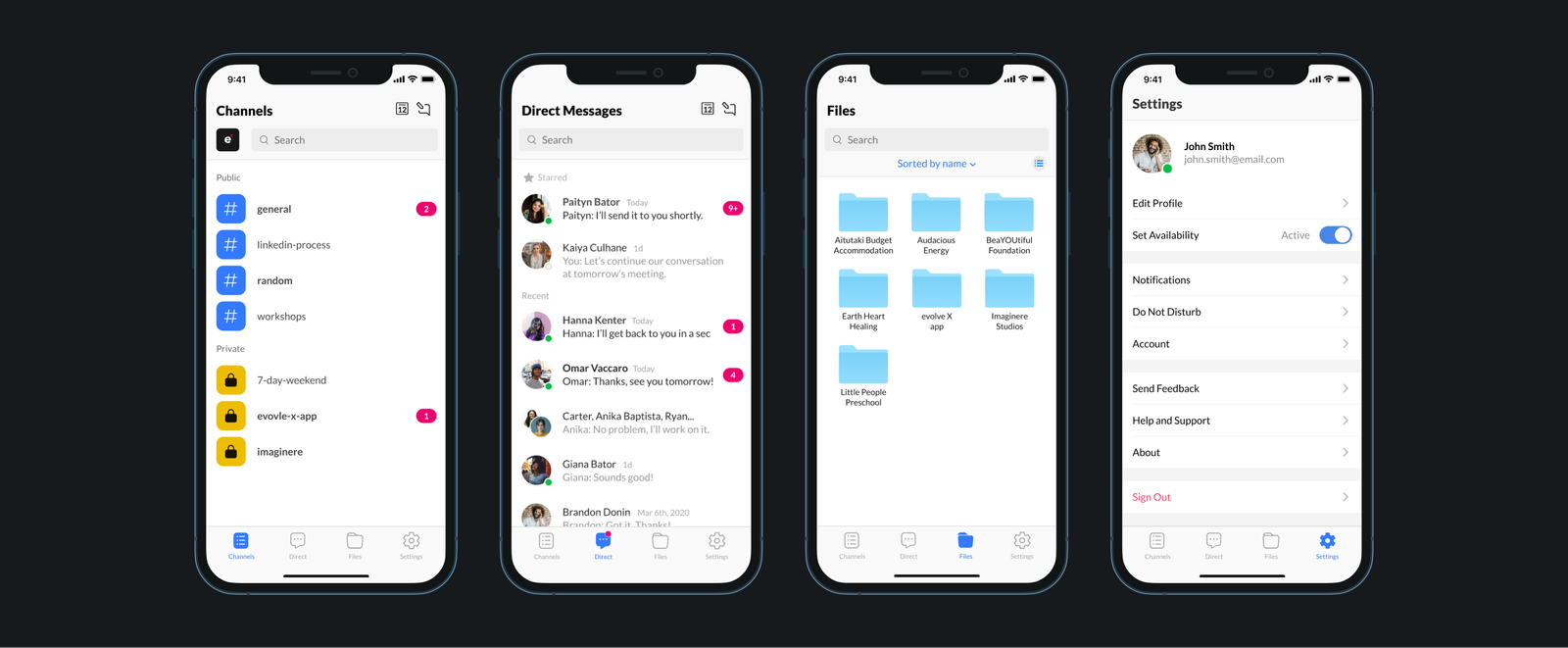
Signup/Login, Shared Channels, Direct Messaging, and Centralized File Hosting.
Outcome: The app was well-received for its ability to support up to 100 call participants and centralize resources. Future versions propose adding AI chatbots to further refine the experience.
Project Impact
Problem
Interns and clients at Evolve X faced a fragmented digital ecosystem. Without a centralized platform, teams struggled to find projects, collaborate effectively, and maintain consistent file accessibility across overlapping third-party apps.
Friction in Onboarding: The initial setup process was slow and lacked clarity, causing significant delays for new volunteers.
Context-Switching Fatigue: Navigating between Slack, Zoom, and Drive created a fragmented user experience.
Scattered Documentation: Critical files were dispersed across multiple platforms, making resource retrieval difficult.
My role as a designer
Leadership & Collaboration
As the UX/UI Design Team Lead, I spearheaded the creative direction for the Evolve X mobile application. My role involved bridging the gap between high-level research and technical implementation, ensuring a cohesive user experience from ideation to launch.
Core Flow Design: Personally responsible for the architecture and wireframing of critical user pathways, including Signup/Login, Channels, and Messaging systems.
Cross-Functional Lead: Collaborated with 3 designers on initial research and conceptualization, followed by a 3-month development handoff with 5 engineers.
Long-Term Oversight: Remained an active part of the project lifecycle post-design, ensuring the final build met original UX specs for the full 6-month duration.
Who our users are
Evolve X Interns: These power users directly interact with the full feature set. They rely on the platform for high-frequency team coordination and seamless asset exchange.
Organizational Clients: Stakeholders who monitor project milestones and deliverables, communicating primarily through system leads and administrators.
Objective
To unify the Evolve X professional community into a single, high-performance mobile platform tailored to their unique collaborative workflow.
Unifying the Workflow
Our goal was to create a mobile ecosystem where interns, developers, and clients could connect effortlessly. Rather than simply replicating Slack, we focused on "feature pruning"—integrating only the tools that matter to Evolve X while eliminating the bloat that causes cognitive overhead.
The Vision
"Create a unifying solution that doesn't just combine apps, but reimagines the workflow to be faster, simpler, and more cohesive for teams across the organization."
The Kickoff
Discovery Phase
We launched the project with a deep discovery phase, uncovering the behavioral patterns of Evolve X interns. By analyzing the tools they already relied on, we identified the specific 'why', 'what for', and 'how' behind their daily productivity.
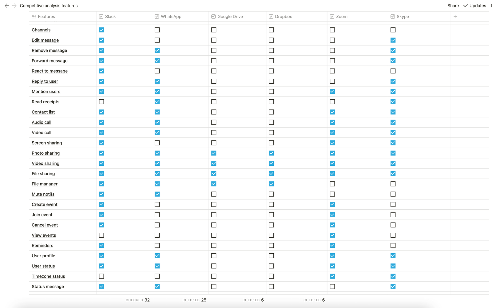
View Competitive Audit & Feature Analysis
We wanted to understand the interns' existing behaviour: Why they were using these apps, what they were using the apps for, and how they were getting things done using those tools.
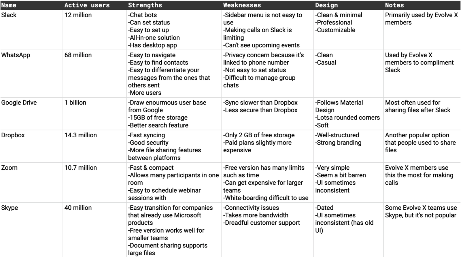
Surprising Findings
While most interns relied on the standard stack (Slack, Zoom, Google Drive), we discovered two unexpected behaviors:
- App Duplication: Teams supplemented Slack with WhatsApp for quicker communication.
- File Habits: Despite having Google Drive, users preferred sending files directly through Slack for convenience.
Deepening User Empathy
Quantitative Surveys: Distributed across the intern network to gather broad, measurable data on tool usage and software friction.
Qualitative Interviews: Conducted 1-on-1 sessions to uncover the deeper operational 'why' behind workflow frustrations.
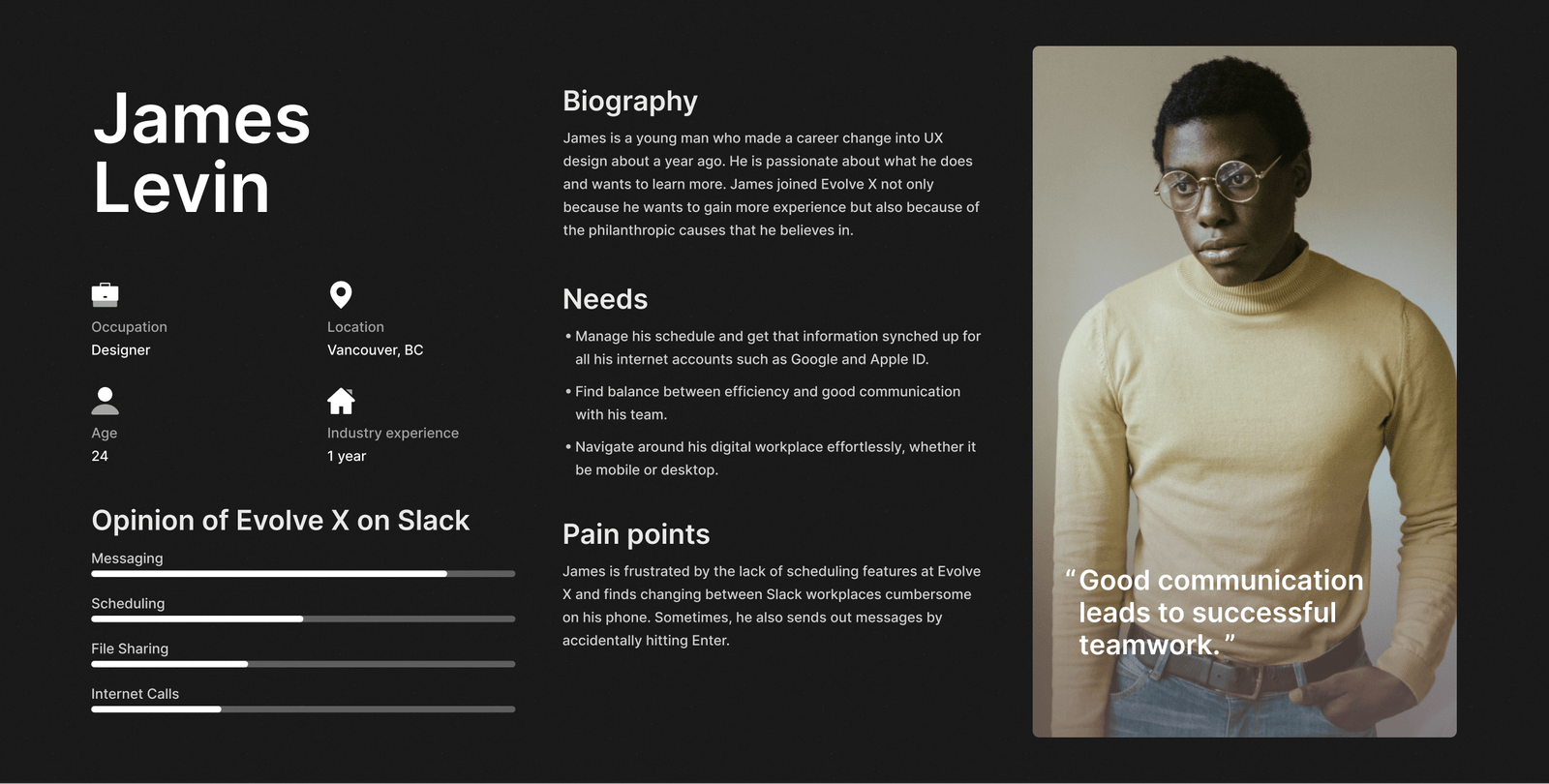
Persona Synthesis: Consolidated the mixed-methods research into actionable, empathetic user personas.
Synthesizing our research
We discovered that Evolve X interns had multiple issues with the apps they were using. Most of these issues revolved around Slack as that was their primary application.
Navigating in Slack was difficult because of the deep sidebar structure.
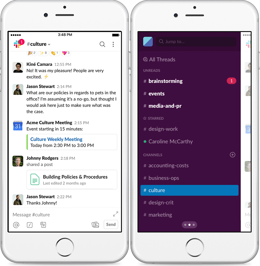
Lack of native scheduling and calendar functionality, relying entirely on 3rd-party integrations.
"On mobile, navigation is a little clumsy. To change workspaces I need to go three levels left. I would like a quicker way to navigate workspaces..."
Were we solving the right problem all along? Based on our research, it was clear we had only identified half the problem. Users weren't just fatigued by switching apps; they had major usability concerns with the individual apps themselves. Simply combining different apps into one "super app" wouldn't solve the underlying UX issues. We needed to fundamentally improve how these features worked.
Reprioritized Project Goals
To incorporate the features our interns needed while actively improving their UX, we set the following priorities:
The Solution
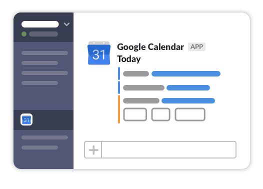
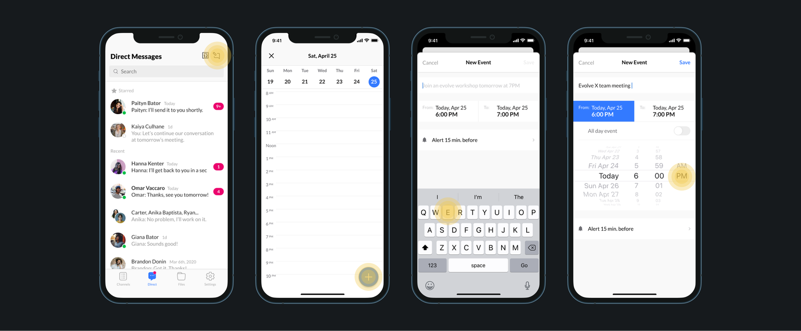
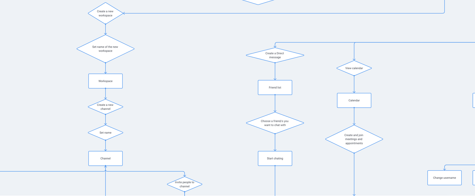
1. In-App Calendar & Scheduling
Evolve X App combines team chat with a simple calendar, allowing you to schedule and keep track of meetings from within the app. This feature makes it easier to send invites and reminders to your team. Having an overview of upcoming events makes the schedule scannable and informative.
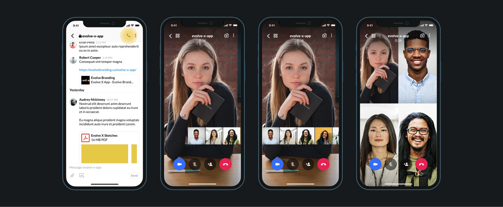
2. Large-Scale Voice & Video Calls
The app allows calls with a maximum of 100 participants, eliminating the need to switch to Zoom. When there are many participants, users can change the layout to optimize screen real estate. A draggable carousel of profile pictures makes scanning the participant list effortless.
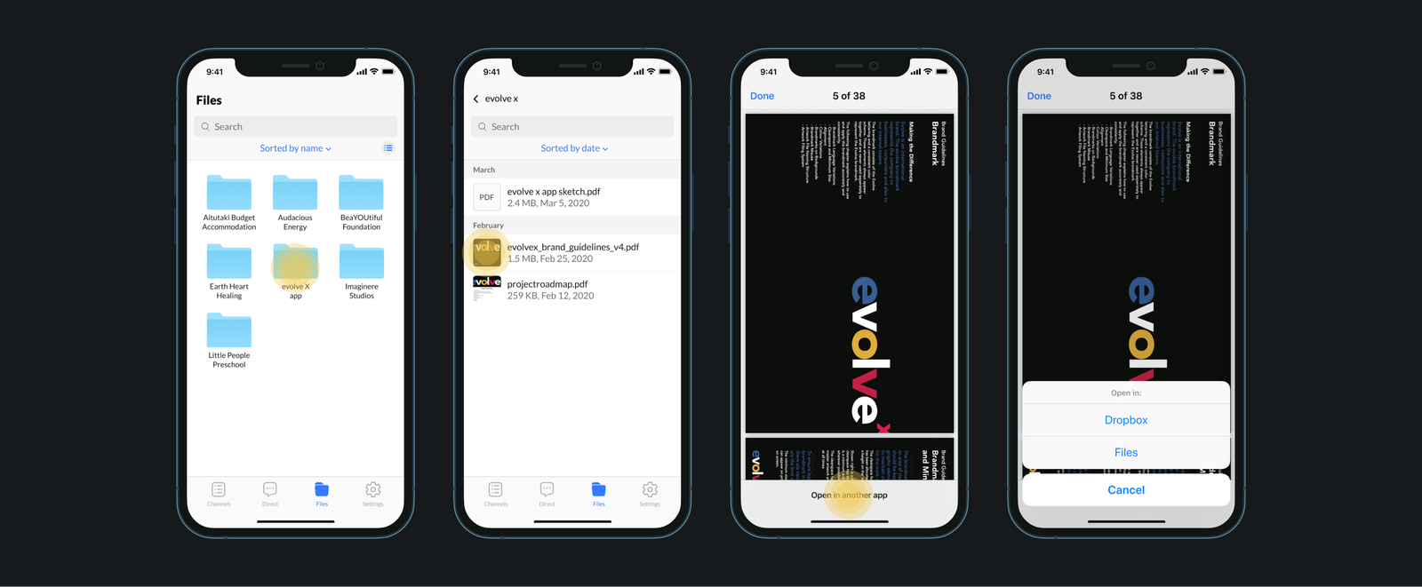
3. Centralized File Storage
No more app-switching to Dropbox or Drive. The native File Manager automatically organizes all files sent over chat in one secure place. By default, DM files are private, but users retain granular control to share, stop, or limit access directly through the manager.
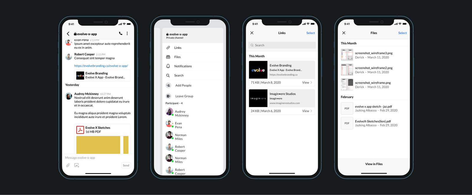
4. Contextual Search in Chat
When in a conversation, users can tap the kebab menu or swipe right to reveal detailed chat information. This dedicated panel aggregates all links, images, and files exchanged in that specific thread, vastly improving resource retrieval speed.
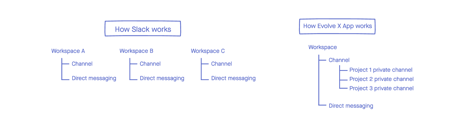
5. Unified Project Workplaces
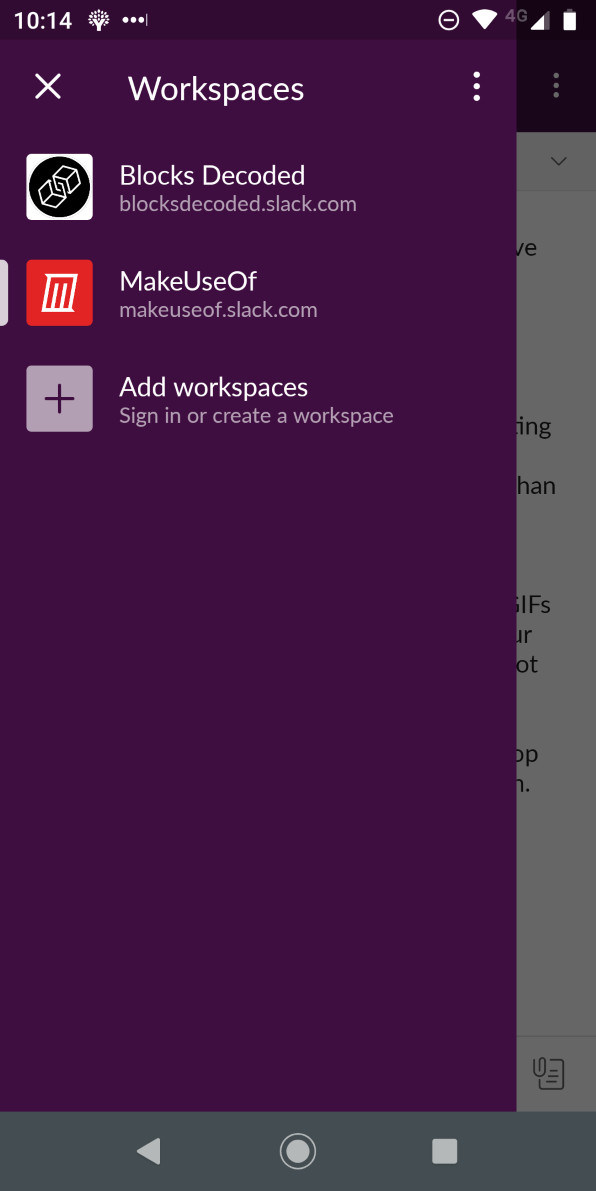
Unlike Slack, Evolve X operates under a single organizational model. Getting rid of siloed "Workspaces" simplifies the ecosystem. Teams have access to common channels by default, and joining a new project simply requires a private channel invite—cutting down sign-up fatigue.
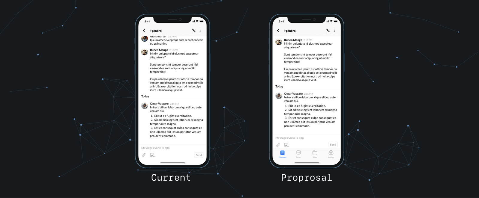
6. Ergonomic Bottom Navigation
We replaced the deep sidebar menu with a highly visible bottom tab bar. By keeping core destinations accessible near the user's thumb, traversal becomes effortless. Gone are the days of swiping left multiple times just to switch contexts.
The Process
Information Architecture
We mapped the information architecture to get a clear view of the required screens and functionalities. By grouping related features, we initially conceptualized 13 screens. We then aggressively narrowed this down to 10 by collapsing superfluous areas—for example, nesting the User Profile as a sub-screen directly under Settings to streamline the footprint.
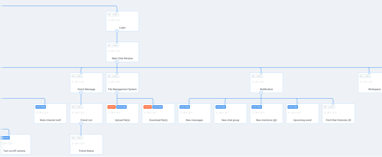
System Workflows
As we mapped the user flows, a critical realization occurred: a direct equivalent to Slack "workspaces" was completely unnecessary. Because all projects operated under the single Evolve X organization, users only needed separation at the discrete project level. This vastly simplified the global navigation.
Additionally, we engineered two distinct flows for the File Manager: one for standard users, and a dedicated admin flow. This separation was necessary to handle permissions safely when admins needed to perform destructive actions like removing or restoring specific files.
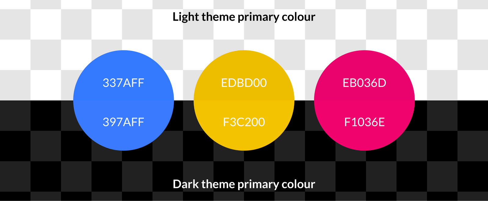
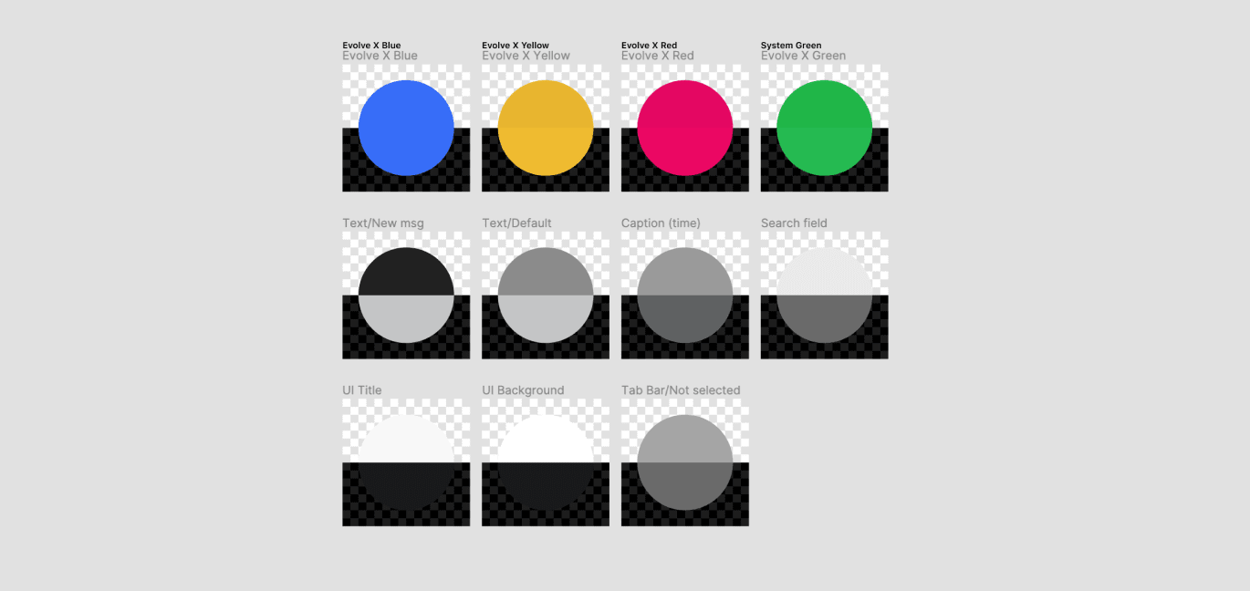
Visual Identity
.png)
Outcome & Reflection
Critical Issues Resolved: User testing validated that the unified mobile ecosystem successfully halted the redundant use of fragmented third-party applications.
The pain point that prompted this project was the redundant use of applications. Slack's 15-participant limit was at odds with Evolve X's live workshops, forcing users to compensate with Zoom, Skype, Discord, and Google Hangouts. Because meetings were held outside of Slack, announcements were easily missed, compounding the need for an integrated calendar.
By expanding on core communication functionalities, we stopped the vicious cycle of app fragmentation. We aggressively pruned unused features to prevent software bloat, creating an experience purpose-built for interns. Evolve X App wasn't meant to replace everything (tools like Gmail and Figma remained untouched), but it unified the daily administrative and collaborative tasks into one seamless interface.
Post-Launch Hindsight
Looking back at this project months after its completion...
While bottom navigation vastly improved global wayfinding, switching between individual conversations became more effortful, requiring a destructive screen-swipe to reach the tab bar.
Proposed Architectural Solutions:
- Keep the tab bar persistently visible within conversations to allow seamless switching.
- Elevate the Calendar to a primary destination on the tab bar.
- Reintroduce a condensed sidebar purely repurposed for the User Profile to free up bottom-nav real estate.
- Integrate a General Assistant Chatbot for onboarding, reminders, and special announcements to make the system more engaging.